It's not uncommon for a situation to present itself where there are simple graphic elements that make a wonderful composition. But at the same time, since we do not control what already exists, we can only take the creative process so far in the capture stage with what is in front of our lens.
When I am given a situation like the one here, where a late spring storm reduces the elements to just the benches and the snow, I will work with lens choice and camera angle to make the composition as good as I can. Bu when I pull the image up on screen in Photoshop, I'll keep an open mind to what could make the image even stronger.
O of the concepts I often look at is the the way the eye moves through an image. There is a natural rhythm by which the eye enters a photograph, and leaves it, much as if we are reading text. For those of us who read from left to right, we look at visuals in the same way. So a composition that guides the eye into the image with ease from the left will be more pleasing than one that blocks that entry. And an image that keeps the viewer's eye within the image will have more impact than one that allows an easy escape.
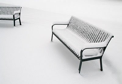
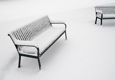
Just look at the difference with how this image looks which the full bench on the left, and on the right.

The image with the bench on the left (which is how the scene really was), brings the eye in low in the left corner, and allows the eye to exit the image through the bench at the right. But by flipping the image, the eye is guided in high on the left, and naturally comes to rest at the full bench on the right. The result is that the eye lingers within the image to examine the details rather than pass through it.
So when you are looking at the composition of an image, take the time to flip it.


No comments:
Post a Comment