Sunday, May 25, 2008
Depth of Field
One of the most important concepts to understand is depth of field, which is the distance in front of, and behind the subject that will be sharp in relation to where you focus. The general rule of thumb is that the greater the ƒ-stop number, the more depth of field you will have. So, for example, at ƒ22 you will have a lot more in focus in front of, and behind your subject than you will at ƒ4.
The benefit of understanding this, is that different subjects benefit from using more or less depth of field. Landscapes, for example, benefit from greater depth of field because you can keep the foreground and background sharp. So you can keep a rock in the foreground in focus, as well as the mountains in the background.
But for portraits, the reverse is generally true. Although in environmental portraits there may be an interest in keeping the surroundings sharp, for the most part, we want to separate our subject from the background as much as possible. So shooting with a shallow depth of field is the way to go.
Just look at this portrait, taken on a basketball court. The important thing here is the personality and expression of the person, so allowing the background to go soft is a great solution.
But what if even shooting wide open (in this case, ƒ4) leaves some areas sharp because they are in the same plane of focus as the subject?
In this case, I duplicated the background layer, used guassian blur on the duplicate layer, then added a mask and protected the person’s face.
Look at the difference in this detail snapshot.
The result is that I’ve added more separation between the person, and the distracting pattern of the fence.
Saturday, May 24, 2008
Add Some Romance
Digital imaging can be powerful ally in many cases for rendering fine detail. But sometimes, it’s just too clinical.
I was shooting a video with a dancer, and between takes, she sat down to adjust her shoes. My eye immediately saw the wonderful play of light on her form, and I asked her to wait for a moment while I grabbed a still camera. We shot just five frames, and then we went back to shooting video.
When I brought the image I liked best into Photoshop, I felt like I had captured the light and composition the way I wanted. But it seemed to me that there was too much detail information in the floor that in the end distracted from the feeling I wanted to convey.
The quick solution was to use the Vignette Blur filter in NIK Color Efex 3.0 to soften the background and keep the focus on the dancer.
Just compare the original image below to the one above. I think you’ll agree that adding a little romance helped make a more pleasing image.
Photosynth
Check out this amazing new technology http://www.flixxy.com/photosynth-digital-photography.htm.
I can see some incredible possibilities, especially for photographer's websites, cataloging, and location scouting.
Tuesday, May 20, 2008
Photographing sculpture
With summer vacations coming up soon, lots of us will be visiting museums in far away cities. We’re bound to be surprised, impressed or possibly even amused by some the work we see, and may want to bring home photographs of the inspiring piece.
Such was the case recently, when I saw the work of sculptor Patrick Dougherty, who fashions tree branches into amazing structures. Sometimes the work is free-standing, but often he weaves his work into existing landscapes and the results are simply remarkable. Just take a look at some of the images, and videos at his website, www.stickwork.net.
This display of his work is at the Museum of Outdoor Art in Englewood Colorado. The museum is adjacent to a business office park, so there is a wonderful relationship between the primordial quality of the sculpture, and the surrounding environment. And it seemed important to show that. So although the first photograph, where the piece is centered in the frame, may be a better summation of the sculpture itself, shifting the framing so that some of the building show in the background give both contrast and context.
Next, I wanted to show the rhythm and sense of movement Patrick builds into his work. The view above has a sense of flatness to it, and really doesn’t have the kinetic quality of the work you feel when you are in its presence, so I moved to an oblique angle, and changed to a wider angle lens. I also experimented with shooting from eye level, and ground level to see if one or the other enhanced the sense of movement, scale or height.
I also wanted to show the relationship of the sculpture to the existing environment, so I moved to an even more oblique angle where you could see the way in which the work was woven into the existing trees.
Finally, I wanted to show the texture of the sculpture, so I moved in closer, and made several graphic compositions that highlighted the tactile quality of the piece.
It’s no different if you are shooting the Michelangelo “David” in Florence, or for that matter, the Parthenon in Athens. Take your time to play with camera angle and lens focal length to create an intimate representation of the art before you. That way, when you return home, you will have images that evoke the experience fully when you look at them in the weeks, months or years that follow.
Monday, May 19, 2008
Flip it
It's not uncommon for a situation to present itself where there are simple graphic elements that make a wonderful composition. But at the same time, since we do not control what already exists, we can only take the creative process so far in the capture stage with what is in front of our lens.
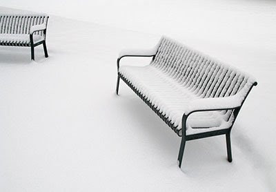
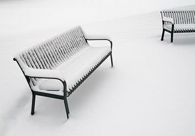
When I am given a situation like the one here, where a late spring storm reduces the elements to just the benches and the snow, I will work with lens choice and camera angle to make the composition as good as I can. Bu when I pull the image up on screen in Photoshop, I'll keep an open mind to what could make the image even stronger.
O of the concepts I often look at is the the way the eye moves through an image. There is a natural rhythm by which the eye enters a photograph, and leaves it, much as if we are reading text. For those of us who read from left to right, we look at visuals in the same way. So a composition that guides the eye into the image with ease from the left will be more pleasing than one that blocks that entry. And an image that keeps the viewer's eye within the image will have more impact than one that allows an easy escape.
Just look at the difference with how this image looks which the full bench on the left, and on the right.
The image with the bench on the left (which is how the scene really was), brings the eye in low in the left corner, and allows the eye to exit the image through the bench at the right. But by flipping the image, the eye is guided in high on the left, and naturally comes to rest at the full bench on the right. The result is that the eye lingers within the image to examine the details rather than pass through it.
So when you are looking at the composition of an image, take the time to flip it.
Subscribe to:
Posts (Atom)