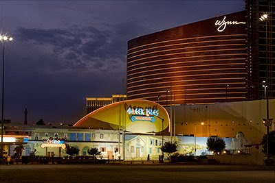
Sometimes we just can't get the image we have pre-visualized in our mind. It could be that the elements we want are not in the same location at the same time. Or it could be that the elements are there, but circumstances are such that you cannot capture the correct lighting for each of the elements at the same point in time. Here's an example of that kind of situation, and how I still got the image I wanted.
I saw this wonderful contrast between old and new Las Vegas one afternoon, and wanted to capture it in as dramatic a way as possible. I decided that the most interesting way would be to shoot it at dawn, when the neon lights of the old Greek Isles would still be lit, but the advancing sunrise would start to illuminate the glass of the new Wynn Tower with warm light, since it faced northeast. Unfortunately, when I went there the following morning, I discovered an interesting problem. The timers on the neon lights were set to shut the lights off at 6:40 AM, but the sun did not put really great color into the glass until 7:27AM. That meant that the image could not be created in one exposure because if I exposed for the neon,the building would be nearly black, and if I shot when the sunlight was right on the building, the neon would be off, creating a flat, lifeless image.
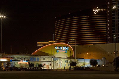
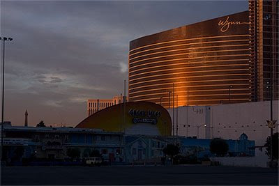
The way I solved the problem was to make sure I got the perfect exposure for the neon in one exposure, and then continue shooting to capture the perfect reflection on the glass. Once I had those, I could merge them in two separate layers in Photoshop, and end up with the image I had in my mind when I first saw the opportunity. In the end, though, I found an exposure of the sky shot somewhere between these two key elements that I thought added more depth, and used that as the sky for the final photograph.
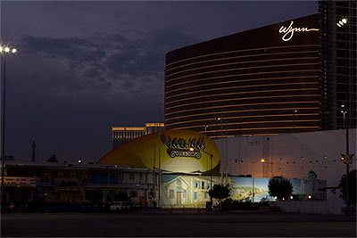
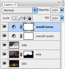
So ultimately, I used three separate exposures to make the image. Here's what the layers looked like in the assembled file, showing the various files, and levels and curves adjustments to make the image pop. One suggestion I would make is to label your layers so that if you have to come back, you know what each one is and what it does. Here, I've labeled the image numbers that I am using with their file number, and the fact that the levels and curves are overall adjustments.
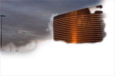
Here is what the layer for the building looked like with a mask so that the sunlit building will come through in the final.
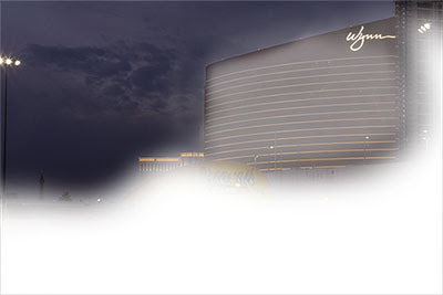
Here is what the layer for the sky looked like with a mask so that the sky comes through in the final.
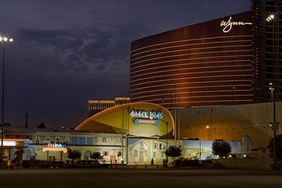
Here's the assembled image, but without the final levels and curves tweak seen in the image at the top of the article (and repeated below for easy comparison). You can see how adding these two layer adjustments makes the image come alive.


No comments:
Post a Comment